Gradients or blends do not print well, and can look uneven or blotchy. We strongly recommend avoiding gradients or blends on the discs.
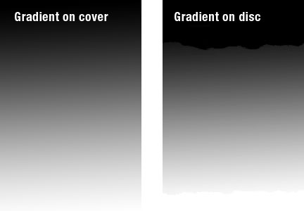
Gradients that look smooth on CD packaging don't translate well to the silkscreen printing process on the disc. Highlights and shadows don't offer smooth transitions, instead dropping off dramatically and resulting in an uneven, rough-looking line.