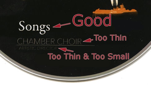
Generally, for your printed pieces you can go as small as 4 or 5 points for black type on a light or white background, 6 points for white type on a dark, black, or complex background (also known as reverse type). This varies depending on the typeface used.
For on-disc printing, we recommend type be no smaller than 6 points, 8 points for reverse type.
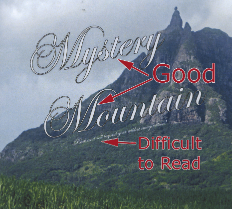
Since we are using inks to print onto either the paper / board stock or disc surface, small or thin text can begin to 'fill in' or 'bleed' and reduce the overall readability or your text. Here's an actual example of what may happen:
For smaller type, such as lyrics and credits, we recommend you use simpler typefaces such as Arial, Helvetica, or Times New Roman. Fancier fonts with lots of detail, like Vivaldi or Edwardian Script—are designed to be used at large sizes, and can be difficult to read when printed unless REALLY large. We recommend nothing smaller than 12 point for the more complex, fancy fonts. Actual example: